MAGNOLIA LAB *
MAGNOLIA LAB *
MAGNOLIA LAB * MAGNOLIA LAB *

Magnolia Lab is a young liqueur brand launched in 2021. Magnolia’s liqueurs present the beauty of Chinese herbs processing with modern mixology’s execution.
MAGNOLIA LAB * MAGNOLIA LAB *
Client
MAGNOLIA LAB
Category
Brand identity
Packaging
Art Direction
Social Media
Marketing
Photo Shooting
Magnolia’s liqueurs present the beauty of Chinese herbs processing with modern mixology’s execution.
Magnolia Lab is a young liqueur brand launched in 2021. It reinvented medicinal-focused Chinese traditional herbal liqueurs into liqueurs that value tastes, design, and user experiences. Magnolia’s liqueurs present the beauty of Chinese herbs processing with modern mixology’s execution. It showed the world that this traditional craftsmanship can rise from its downhill with a much younger, elegant identity that suits modern lifestyles.
BRAND IDENTITY
Logo Design
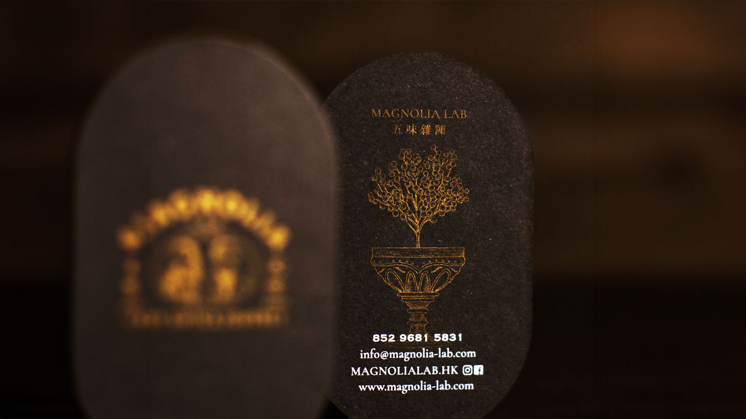
Name Card
Stationary
Brand Message
Art Direction
Inspired by trademarks in the Meiji Restoration period where the East met the West and fusion of cultures bloomed, the key visual of our logo is the portraits of the two founders, a Chinese medicine practitioner - James and a mixologist - Dennis.

Every Sip is a Journey *
Year 2020 saw the world devastated by the pandemic. Plans became irrelevant and life was put on pause. Some call it a lost year, while others took it as an opportunity to reconnect with the inner self, to reflect, explore, and figure out what the heart really wanted.
We created the Brand message"Every Sip is a Journey." Every time we tried a new infusion, the complex taste resulting from the indefinite combinations of herbs, liquors and time brought us on an adventure.
Every Sip is a Journey *
PACKAGING DESIGN
Outter Box
Bottle
Bottle Label
Wrapper
Magnolia Lab created two botanical liqueurs - Magnolia 五味雜陳 and Roselle 閉月羞花.
We incorporated the shape of calabash, a traditional symbol for Chinese medicine, brown glass jar of modern apothecary and exquisite engravings into the design of the bottles.


MAGNOLIA
Magnolia label design features a man and a woman with smiling lips but tearful eyes, expressing the bittersweet taste of Magnolia, just like the feeling of laughing while crying or crying while laughing. This taste reflects the ups and downs of life's journey, with both joys and sorrows.


Wrapping papers combined the ideas of wrappers used in traditional dispensaries and outline of the present-day cocktail recipes and tasting notes.Wrapping papers combined the ideas of wrappers used in traditional dispensaries and outline of the present-day cocktail recipes and tasting notes.


ROSELLE
Roselle is similarly understated and elegant, like a gentle and stunning woman. Therefore, we used a dark red color for the label and paired it with an elegant woman, creating a low-key and elegant design.


SOCIAL MEDIA
Content Create
Photo Shooting
We created Magnolia Notes, Magnolia journal, Magnolia Moments to let people know more about magnolia lab in different angle, not just only the product. It's about the value and message in the world.


MERCH
Content Create
Photo Shooting
The brand assets directly mirror the look, feel, and overall emotional tone reflected in the physical bottle and in the beverage itself. The verbal branding, specifically, evokes an extremely sensual and inviting atmosphere that feels at once intimate and accessible. Hyper-specific imagery was used in both the storytelling and visual scenes. This allowed us to communicate the brand concept and essence through each and every consumer touchpoint.


